Background
As time grows, the internal app release at iHandy process became redundant and difficult to optimize.
This time we refactor the whole process and the interaction, which will benefit approx. 7k releases in the coming 2 years.
Role
- User Research
Information Architecture
Interaction Design
Usability
Situation: Before
The internal app release process at iHandy is an internal process which makes people audit and confirm essential details to make sure that an app (version updated) will successfully release from the app store.

Where this app release process is
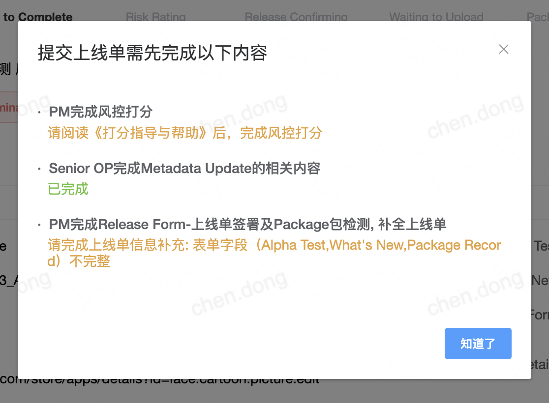
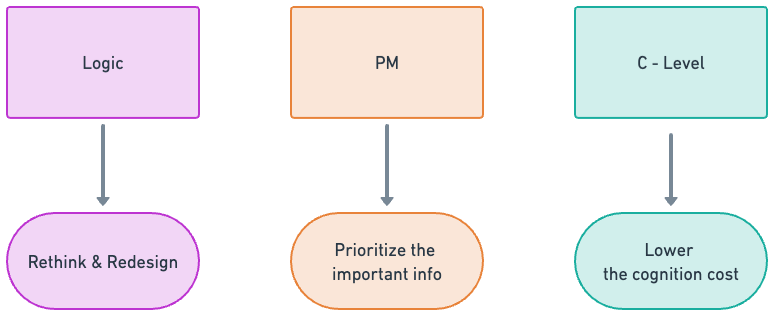
Due to different reasons, current main painpoints are:
Too much information added later are complex and invisible to the user so that it increases user's cognition load and decreases user's working efficiency.
Before
- 24 Hours General Time to Finish
- 10 Days Max Time to Finish
Goal
- 4 Hours Ideal Time to Finish
- (Friday afternoon, not too late)
1 - Early this process initially has only 3 - 5 steps, during each step just one user does one thing. As time goes, the main process now contains too much steps than it was at the beginning, and each condition switching from one to another is quite complicated.

A notice given to the user afterwards, creating a frustrating experience
2 - During each step now the tasks within contains too much information to different users that they don't know what to do specifically.
3 - For the interface the user may get lost since the layout doesn't provide a clear path for reading. They find it difficult to locate quickly what they should focus and the critical operation button is relatively hard to find.
4 - Codes are highly customized for each process (Aboard / Overseas * iOS / Android) that complicated logic is embedded within the codes, which makes it difficult to debug or optimize.
User Research
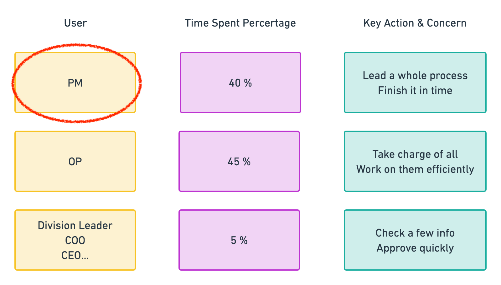
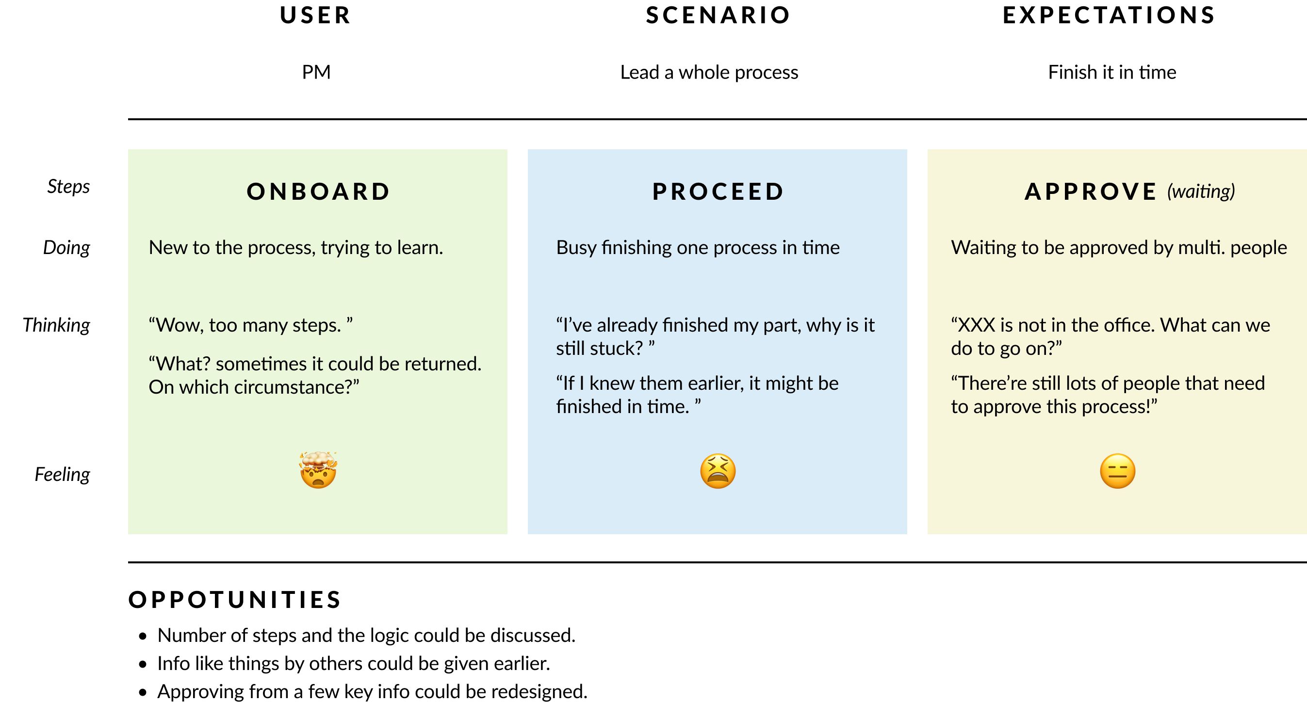
Our product manager and UX designers took part in the user research part. After grouping our users, we build user journey map based on key user interviews (i.e. PMs) and find several oppotunities.

User Info

User Journey Mapping and Oppotunities
Solution
We did a lot for the refactoring this time.
We use different strategies to treat with different issues.
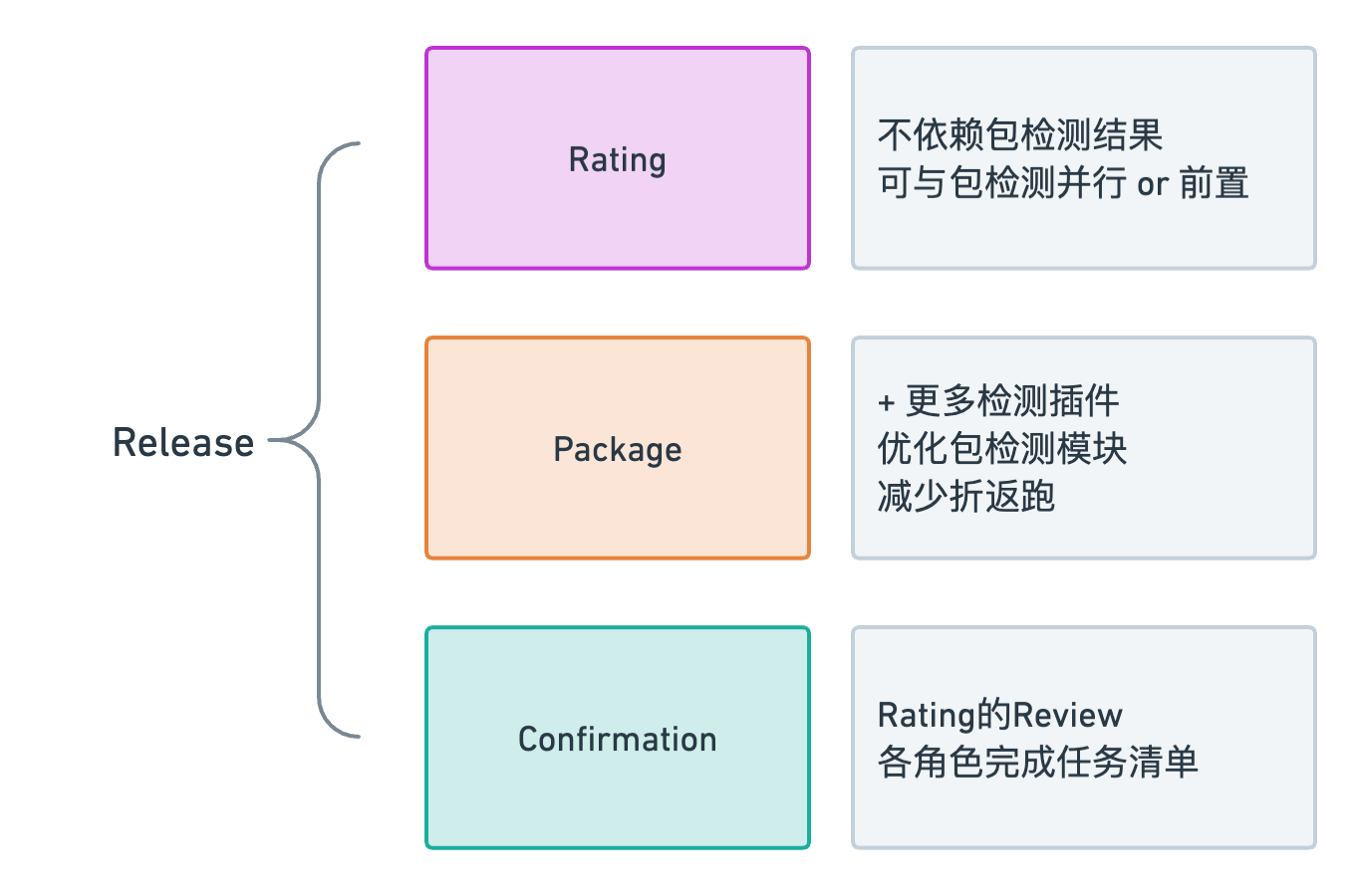
1 - We simplify the process into 3 different parts. For each stage we define new rules to facilitate working efficiency.
This is not only optimization from ux/ui, it's also a refactoring of codes. The old customized process are now united into one general standard process.

Rating is independent of Package, and Confirmation is somehow related to Package
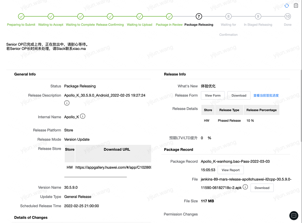
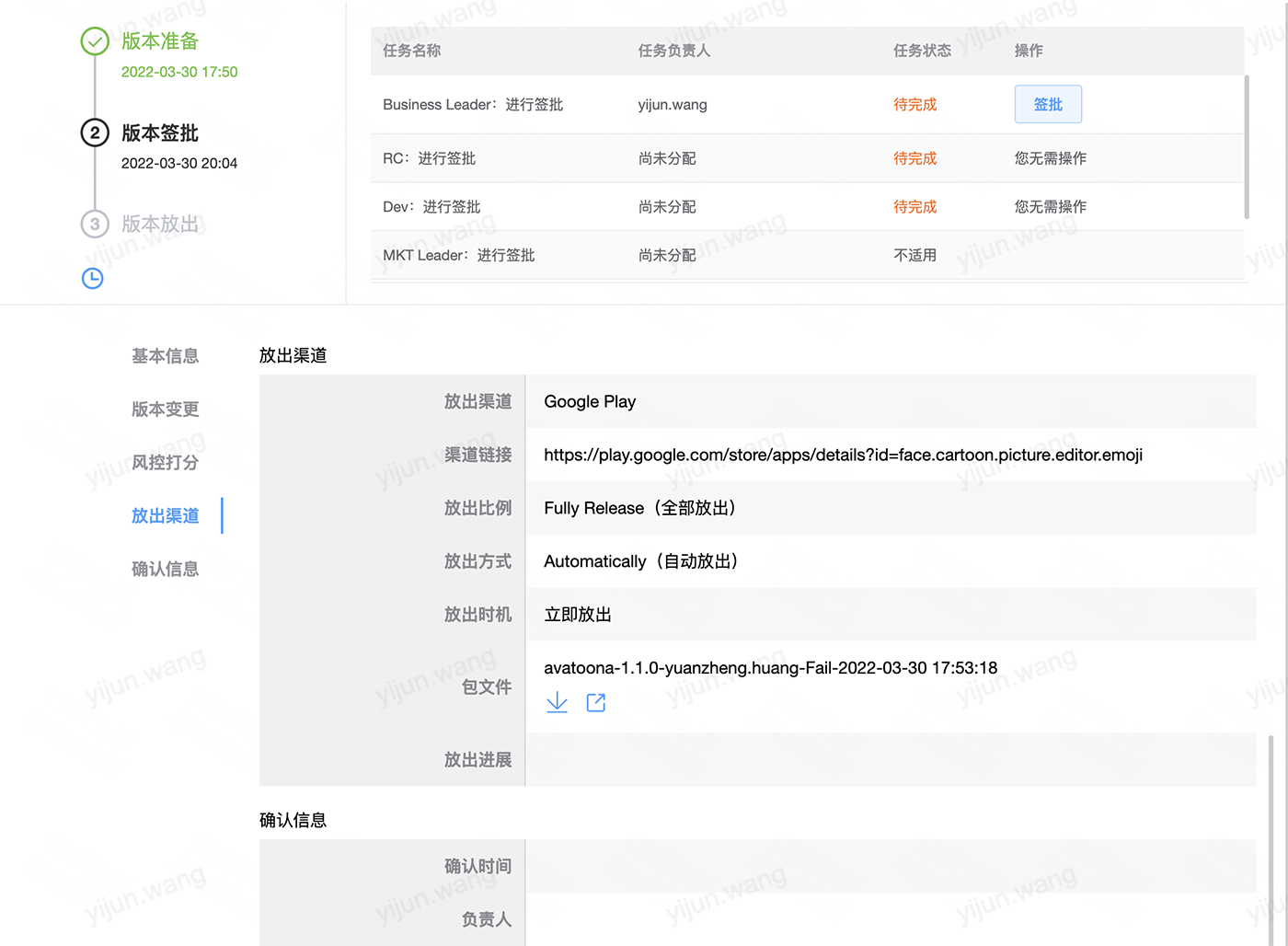
2 - We introduce a new subject "Task" into this frame and reconsider the rule of processing. The steps are not allowed to return, and the tasks within one step can be done simultaneously. Thus each role can clearly know his / her task to do and take action without any doubt.
For the task I specify the details, including description / responsible person / status / operation, and optimize display order to prioritize current user's task.
And those general operation buttons are located just below the steps now, which is appropriate for user to find and use.
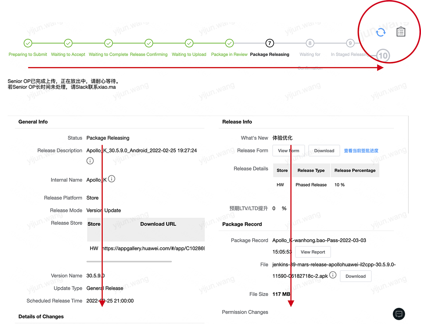
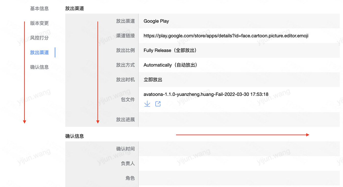
3 - I also change the layout. Table of contents is added to find section quickly. In the table if there are too many columns, you can scroll horizontally to view more.
Now the two parts of the page (the process shown above and current form detail) is shown in a similar way, making it easier to locate information.

New layout of form detail and reading order
The mechanism of sending notifications to the approvers is also optimized. The new mechanism sends notifications to all at the same time and gives backup plans to prevent absent issues.
4 - We borrow the idea of one general template + multiple customizations from a project management tool to refactor the code. This makes the code more manageable and scalable.
User Feedback and Following Benefits
Along with a User Manual, we only spent 1 busy day of queries. Then the working efficiency is highly improved, and we no longer have to worry about endless modifications on a redundant process, which nearly takes 1/3 of our daily workload.
This new release process is estimated to be operated in the next 2 years, boosting efficiency or approx. 7k releases.
Before & after: optimize release process greatly
Key Metrics
- Error Rate ↘
- Task Time ↘
- Efficiency ↗↗


